Making DNA look simple (again)
Apr 10, 2012, 6:30p - Science
I recently got sick of doing science. After observing my own productivity and passion for science ebb and flow over the past few years, I've found that I live a roughly 6-month cycle: 6 months of scientific experiments, 6 months of something else (usually programming, often blogging, sometimes installing hardware floors and doing experiments on myself). It seems that when the weather starts to warm I find myself taking a step back and reflecting on what I've done in the last half year... and deciding not to do any more of it. Reflection-time seems to have come early this year, likely accompanying the early warm weather to Boston.
So what to do instead of experiments? I usually direct my idle-free energy toward programming, but I was looking for a small project, just a little something to change the pace of life.
Way back in 2009 I wrote a simple web-app called the Exon-Intron Graphic Maker. It gets used about a couple hundred times per month, which I find pretty neat for such an esoteric, simple piece of software. And people seem to like it. As you can tell from the comments below, there have been some feature requests, but until last week I had not an inkling to do any of them. Mostly because I couldn't figure out a simple user interface for some of the features. But then in a conversation with Christoph we came up with some good ideas, so away I went.
With that, I'd like to introduce the 4th version of the Exon-Intron Graphic Maker. Here's a screenshot:
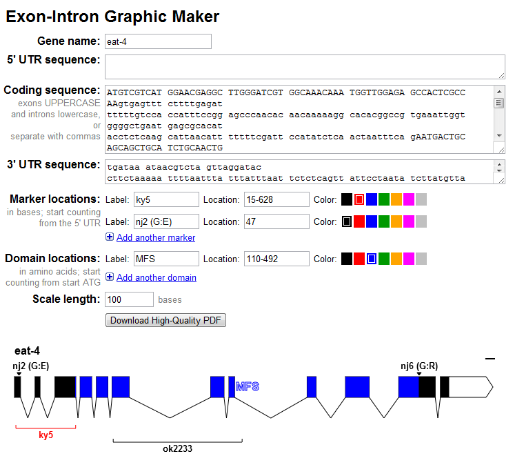
New in this release:
Colors! You can now color your mutations and deletions from a small handful of colors.
Labels! The gene's name, mutation labels, and deletion labels will now be displayed in the graphic. No need to import the PDF into another program to add these labels.
Protein Domains! Due to popular demand, you can now specify protein domains (in amino acid coordinates) and they will get shaded with the selected color. This can be handy if you want to visually compare where a deletion (in nucleotide coordinates) is relative to a protein domain.
Save as PNG! You can now right-click on the generated image to save the image as a PNG. This feature worked before in Firefox, but now it also works in Chrome.
As always, you can download a publication-quality vectorized PDF, which includes colors, labels, and protein domains as well.
If I get some momentum, I may still implement alternative splicing as well as a possible protein-only view with just domains and mutation/deletion sites displayed (introns and UTRs hidden).
But for now, enjoy!
=======
UPDATE #2 (Nov 19, 2009): Users can now change the scale bar to any length they'd like in the Exon-Intron Graphic Maker. The default had been 100 bases, but for people working with genes much longer than worm genes (such as human genes), the scale bar would disappear into single-pixel oblivion. So now users can set the size of their scale bar - a minor victory in the ongoing war for all that's good in this world.
=======
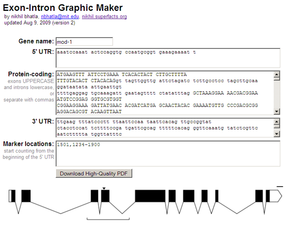
UPDATE #1 (Aug 9, 2009): I've just updated the Exon-Intron Graphic Maker with a few more features. You can now use it to draw untranslated regions (UTRs) of genes, indicated as white, unfilled rectangles. It's also easier to input your gene sequence, as exons can be indicated as UPPERCASE bases and introns as lowercase (which is how some services, such as the C. elegans sequence repository at WormBase.org, store their sequences). You can still enter exons and introns separated by commas as well, if you don't use case in this way in your own sequence files. Finally, you can also enter specific locations or regions, and the program will draw arrows and brackets around the regions. This can be useful for indicating mutations and deletions in your gene.
=======
ORIGINAL POST (Jul 25, 2009):
(OK, so I just made a simple tool for biologists that probably won't appeal to 99% of the people who read my blog. Nonetheless, I blog on. Let's start with some basic biology.)
The most important concept in the field of molecular biology is known as the "central dogma". The central dogma basically says that in a cell, DNA is used make RNA, and RNA is used to make protein. Proteins are the physical chunks of molecules that enable the cell to do many of the things that a cell does: move around, ingest things, secrete things, stuff like that. While the central dogma is a simplistic view of molecular biology, it seems to be mostly right.
So let's talk about the first two pieces, the DNA and the RNA. DNA and RNA consist of repeated molecules chained together. The molecules that make up DNA and RNA are called "nucleotides" (also known as "bases"), and there are 4 different kinds: adeninine (A), cytosine (C), guanine (G), and thymine (T) in DNA or uracil (U) in RNA. When you identify the order of these nucleotides in a specific piece of DNA/RNA (e.g. ATTTTCGATCGCTTTAGC) you're said to have "sequenced" the DNA/RNA.
What surprised many biologists when they began sequencing DNA/RNA was that though there was a ton of DNA (billions of nucleotides in humans, a hundred million in the microscopic worm C. elegans), only a small fraction of it was found as RNA. If I remember right, the statistic is something like ~1% of DNA actually transcribes into RNA in humans.
One last definition: a portion of DNA that will eventually be converted via RNA into a single protein is called a "gene". So within a given gene, biologists found that some parts get cut out of the associated RNA before it can be translated into protein. These parts of a gene are called "introns", while the parts that eventually become protein are called "exons".
Phew, background done, now to the meat of it all. Often when a biologist publishes a paper on a gene they've been studying, they'll show the exon/intron map of the gene in a simple schematic like so:
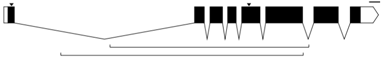
In this graphic, the exons are indicated as black rectangles. Filled rectangles indicate RNA that is translated into protein, while unfilled rectangles indicate RNA that is not translated into protein, though also not cut out like introns are. The introns are indicated as bridging gaps. This representation of an intron is appropriate because the RNA effectively gets "stitched" together in this way, with introns getting cut out. In the example above, the gene has 8 exons and 7 introns. These diagrams are also supposed to be to scale, so that the lengths of the rectangles and gaps correspond proportionately to the lengths of the exons and introns that underly them. The little downward arrows above the exons point to specific bases (e.g. ones that have been mutated). The upward-facing horizontal brackets below the introns indicate regions of interest (e.g. parts of the gene that have been deleted).
I was talking to some labmates about these graphics, particularly wondering how they generate them for their papers. As it turned out, both of my friends effectively drew them by hand on a computer, counting out the number of nucleotides in each exon and each intron and drawing boxes and lines of rougly the same proportions. This seemed tedious and error-prone, so I asked them if they knew of any programs that could make these graphics for them. They knew of none, and I mentioned that it would be trivial for a programmer to make one. They thought it would be really useful if someone made such a program, but of course they themselves didn't know how to program. So I added it to my mental list of nifty tools for scientists that I might one day make.
Waking up this Saturday morning, I sat in front of my computer with nothing particularly interesting to do. For reasons still unbeknownst to me, 7 hours later, I snapped out of a reverie to discover that I had written such a program (the example above was rendered with it). So here it is:
Perhaps the most important feature of this webapp is that it produces a vectorized, high-quality PDF of the inputted gene model. When submitting a paper to a journal for publication, the journal requires high dpi, publication-quality graphics (simple bitmaps just don't print well). With a PDF containing vector graphics the biologist can scale the gene model to whatever size and resolution they wish, annotate it with other information (e.g. scale, gene name, mutation names), and submit to the journal, all without any loss of visual quality.
Anyhow, that's it. Useless to most, but hopefully somewhat useful to some. I know at the very least that I'll use it, assuming I can find a gene important for consciousness :)
Read comments (55) - Comment
Tron
- Jul 25, 2009, 10:27p
Thank you very much for making this available.
belle
- Aug 5, 2009, 7:16a
this is the best thing since sliced bread!! thank you just saved me thousands of hrs
dude,
- Nov 3, 2009, 6:33p
awesome.
jasonII
- Nov 12, 2009, 8:59a
Thanks, this works great. A few things though. Some of us work on large (18kb) genes. Is there any way to change the scale bar? Also, being able to indicate alternative spice events would be nice.
nikhil
- Nov 18, 2009, 9:29p
Thanks for the request jasonll. I've updated the graphic maker so you can now change the size of the scale bar, to be something more appropriate for your 18kb genes. Not sure what the convention is for indicating alternative splice sites - why not just make 2 separate gene models? I guess if there are several it would be nice to consolidate them into one image. If you have any ideas about what this would look like, lemme know.
nikhil
- Nov 19, 2009, 11:54p
Alan Marnett over at Benchfly.com asked me to write a blog post for them about the Exon-Intron Graphic Maker. It's just like this post, slightly revised. Storing the link here for safekeeping.
http://www.benchfly.com/blog/making-dna-look-simple/
omar
- Nov 29, 2009, 11:07p
dude this has advanced my research significantly
jasonII
- Feb 21, 2010, 8:40a
thanks for the scale bar modification. about the alternative splicing, i suppose it would be helpful if you could color them in. this would also be helpful to mark out certain functional domains easily. three or four colors would be wonderful and spice things up a bit!
siavash
- Apr 4, 2010, 6:10p
hi nikhil,
i also wanted to thank you for making this available. saved me so much time. also wanted to second jasonII's comment about other colors, for marking protein domains, etc.
but its wonderful, thanks a million.
Nick
- Nov 15, 2010, 7:09a
Thank you very much for this. I am an undergraduate doing a genetics research project and this has given me the ability to graphically show exon and intron positions the way I wanted to!
Pascal
- Feb 27, 2012, 7:34a
Great tool. What you also might want to consider is that UTRs can be across more than one exon. I think with the current options it is not possible to do that.
nikhil
- Mar 10, 2012, 7:36a
Pascal, actually I think you can do what you want.
Just like with the protein-coding field, separate exons and introns in the UTR fields with commas, and you'll be all set. That way you can display a single UTR containing multiple exons and introns.
jsto
- May 18, 2012, 1:24a
Thanks a mil nikhil
I wonder if its possible to extend the image to show up and downstream regions?
Pakpour
- May 31, 2012, 12:40p
Thank you thank you thank you so much for sharing this program. You have saved me huge amounts of time and it is such an easy and intuitive program to use!
BMD
- Dec 27, 2012, 12:29a
Hi Nikhil,
Thank you for this awesome tool! I used it to make a figure for my PhD thesis. I couldn't find any other tool that would draw high-res gene structures for me. At first, I was skeptical, because your tool required manual input of the sequences and boundaries, when this information is already available for my genes in GenBank. Also I was worried that the spaces and numbers that were contained in the sequences I pasted would mess things up. But it worked fine and only took a few minutes to copy-paste the sequences and put the commas. The genes I'm working with are monster genes with tons of exons each, and some very long introns, so I'm glad it worked so well. The only thing I would have liked is to have an option to have the exons numbered.
Jason
- Nov 2, 2013, 11:03a
That is art!
Steve
- Oct 15, 2014, 6:53p
very cool! i'm using it to make group meeting slides, and am finding that the text is coming out a bit small. any way you could add a feature to let you change the font size?
nikhil
- Oct 20, 2014, 8:10p
Hi Steve,
To make changes to the text or anything else in the graphic, download the PDF and open it in your favorite graphics program. I use the open source alternative to Adobe Illustator called Inkscape. There you can make any changes to your heart's delight.
Kuldeep
- Jan 14, 2015, 7:44a
How to add the size of exons (bp) or introns (bp) in the map? For comparison of same gene of different organism, is it possible to go in single run?
Although it is very helpful I would like you thanks a lot.
nikhil
- Jan 14, 2015, 8:02a
Hi Kuldeep,
There is currently no way to automatically annotate each exon or intron with its length in base pairs. I have never seen this kind of annotation before. Can you point me to an example of what this would look like?
Also, there is no easy way to compare multiple genes (e.g. across organisms, across isoforms) at the same time, yet. This feature has been requested several times so I may add it in the future.
Lisa
- Jan 15, 2015, 7:14p
For some reason, the scale bar isn't changing for me whatever number I put from (1-1000bp). Is there anyone else facing similar problem or is it me only??
nikhil
- Jan 15, 2015, 9:25p
Hi Lisa,
What browser, browser version, and OS are you using? Are you referring to the graphic made in the web browser, or the downloadable PDF? I just tested the graphic generated in the web browser on Firefox, Chrome and Internet Explorer on Windows 7 and the scale bar resizes just fine. How many bases have you entered? You have to enter some bases before the scale bar will be displayed.
Lisa
- Jan 18, 2015, 1:51a
Hi Nikhil,
Thanks for your reply. I misinterpreted the use of the scale bar. Is there any means to increase the width of the exons ? (and the introns could probably be joined by dots which are not to scale) I am working on human genes and there are a good number of mutations to show in a single exon itself. The width of the exons doesn't permit me to be able to show all the mutations.
Thanks again
nikhil
- Jan 18, 2015, 8:43a
Hi Lisa,
There is no method for increasing the width of the exons. The main function of this app is to quickly make exon-intron graphics that are to scale. I'll keep your issue in mind, but for now I suggest using the Exon-Intron Graphic Maker to make the gene model to scale, and then downloading the PDF to alter the scale in a free app like Inkscape. You could also mark all the mutations in the Graphic Maker, even if they overlap and are too dense, and then spread them out in the PDF so that relative position within the exon remains to scale.
YZ
- Nov 10, 2016, 6:19p
I really enjoy the program. Please excuse my otherwise probably simplistic question. When creating a gene diagram, there are some exons that could be small at only few dozen bps. Some introns, on the other hand, could be thousands of bp. If done this way, when looking at the final graphic the exons are tiny because they are drawn to scale in proportion to the intron size. Is there a good way to account for that or would you suggest a different way to graphic it? thanks!
nikhil
- Jan 25, 2017, 10:42a
YZ, I would suggest a different approach in your case. Seems like you want a graphic that has different scales for the exons vs. the introns. My webapp doesn't support that right now, I'm afraid. I'm not aware of any way to do that except by hand in a graphics program.
Ankita Gurao
- Aug 21, 2017, 12:04a
The tool is very elegant and handy.Brilliant solution for presenting gene structures in publications. I have a suggestion for you, add a 'How to cite?' section.
Claud
- Sep 28, 2017, 6:50a
Thank you for the program. It have been very useful for me.
Could it be possible to add a section upstream and a section downstream of the beginning and end of transcription (respectively)? It would be very useful to add markers in those sections. Thanks!
nikhil
- Oct 5, 2017, 10:41a
Hi Claud,
Yeah, there isn't any easy way to depict non-transcribed regions using this web app. I'll consider adding something like this in the future. Glad you find this useful.
nikhil
- Oct 5, 2017, 10:43a
Ankita,
If you want to cite this web-app, you can use the following citation:
Bhatla, Nikhil. 2012. Exon-Intron Graphic Maker. Available at http://wormweb.org/exonintron
Claudia
- Aug 28, 2018, 6:31a
Good morning, first of all thank you for the useful program.
Is there any chance to change the color of the black bar representing the DNA sequence and to reduce it a little bit (or to increase the written label's size)?
I know it is a futile quesiton but it will improve the appeal of my immage.
Thank you very much.
Sean
- Mar 26, 2019, 12:36p
Here it is, 2019 and 10 years after you made this, and I only just discovered this tool. I just wanted to say thanks for sharing, it is very much appreciated!
Guangzhao Qi
- Oct 13, 2019, 2:26a
Thanks a lot!
nikhil
- Feb 4, 2020, 9:39a
Claudia,
For color and size changes, the best thing to do is to open the PDF in a illustration program, such as the free Inkscape. There you will be able to edit everything to your heart's delight.
Abdellah Barakate
- Feb 12, 2020, 3:10a
I love this Exon-Intron Graphic Maker but I am stuck with an issue. I have genes with introns in the 5'UTR and/or 3'UTR. Does anybody know how to add these introns?
Many thanks.
Abdellah Barakate
- Feb 12, 2020, 3:22a
Sorry guys, I just realised that I can add introns to UTR by simple using upper and lower cases as in the CDS.
Cheers
Sara
- Apr 9, 2020, 4:51p
Thank you very much for the nice tool!
Basharat
- Aug 13, 2020, 10:25a
Hi,
Can we use it for mapping point mutations in exon of mammles
nikhil
- Aug 27, 2020, 9:20a
Hi Basharat,
Yes, this program works with a genetic sequence from any organism.
Liina
- Oct 27, 2020, 8:16p
Thanks for this useful tool! I managed to retrieve PDFs for all of my genes, except TTN, which gave me an error 'The requested URL's length exceeds the capacity limit for this server' (PNG downloads ok). I blame the size of the gene (281 kb). Is there a workaround to retrieve the PDF that I could work with in the Illustrator?
Hart
- Dec 21, 2020, 6:15p
Useful tool!
Thank you very much
Vanessa
- Feb 21, 2021, 7:38a
Thank you so much for this useful tool! Is there any way to present genes in the negative strand? i.e. so that the pointer points to the left instead of pointing to the right.
David
- Mar 17, 2021, 7:59a
Fantastic tool! Thank-you for making this :)
SKT
- Jun 2, 2021, 4:27p
Hi, Is it possible to avoid having to manually enter the gene sequence? I have a long 20Kb gene.
GyuHwang
- Nov 23, 2021, 12:03a
Thank you. It's very useful tool.
When I just know intron length, so I use a exel function [=rept("a",intron length)] result. It is working well. :)
Erik Huckvale
- Mar 1, 2022, 12:33p
What tool do you use under the hood for the visualizations? Is it an R package or something with javascript?
Robert Mukiibi
- Oct 9, 2022, 7:34a
How about making it possible to color introns and exons different colors than just black.
Tamir P
- May 29, 2023, 5:16a
what a grate tool!
but- having problem with exporting as HQ PDF (500 Internal Server Error)
Linx
- Jun 15, 2023, 8:09a
Why cannot download the PDF from this website anymore?
Yanyan
- Jun 29, 2023, 7:20a
hihi,thank you so much for coming up with such a simple handy tool.It is a big big help, but unfortunately ?I can't download the PDF,I don't know if you could receive my message, if so, that would be great!
T
- Aug 4, 2023, 12:42p
Thank you so much for making this tool! I've been using (and citing) it for years. However, I just went to use it today and received an "Internal Server Error" message after clicking the "Download High-Quality PDF" button. Could you please help?
nikhil
- Dec 10, 2023, 12:04a
PDF download error should be fixed now. Sorry for the trouble!
Ish
- Aug 7, 2025, 10:46a
Is there any way to get gene and allele names in Italics?
Thank you.
HYY
- Sep 19, 2025, 2:43a
Thank you very much! It helps me a lot!
Anonymous
- Jul 16, 2026, 1:39a
GACTTGCCTTACCATTAAAAAGCAAGGGGAGCACAAGCATTATTACACAAAGCAAAAGCACTAGCCATGGCAGCGTCGCGCTACGAGGTGGAGGTGACGGTGGCCTCGGCGCGCGACCTCAAGAACGTCAACTGGCGCAACGGCGACCTCAAGCCCTACGCCGTCGTGTGGATCGACGACGGCGCCAAGTGCTCCACCCGCGTCGACCTCGACAACGCCGACAACCCCACCTGGGATGACAAGCTCACCGTCCCTCTCCCGCCCTCCACCCGCCTCGACGACGCCGTCCTCTACCTCGACGTCGTCCACGCCAACGCCACCGACGGCGTCAAGCCCCTCGTCGGCTCCGCGCGCCTCCCGCTCCGCGACGTCCTCGCCGACACCGGCATAGGCGCCCGAGCCTCCCGCTCCCTCCGCCTCAAGCGCCCCTCCGGCCGCCCCCATGGACGCCTCGAAGTCCGCGTCGCCGTCCGCGAGCCCAAGCGCTACTACGACCCCTCGCCGGCGTACCCTGCTCCCTACCACCAGCAGTCGTCCCGTGACCCCTACGCCTACGGTAACACTACAACTGGTGGCTATGGCTATGCCTATGGCGGGGCCCCTCCGGCTCCGTACTCCGCGGCCCCTCCTGCTGGATACCCGTCGGCCTATGGAGGAGCGGCTCCTACTCAACCTGCCTATGGCTCCGCCGCGCCACCTCAACCTGCCGCTGTCAGCTATGGAGCGCCTCCTGTGGATGCAAAGAAGAAGAGCAAGATGGGCATGGGGGGTGGGCTGGCGGTTGGCGCGGCGGCCGGCGTTCTTGGCGGTCTGGCGCTGGCGGGCGGCGCCAGCTACCTGGAGAACAAGTTTGAGGATCGCGTGGCGGAGCGGGTGGAGGAGGACCGCTACGGCGGCGGCGGTGGTGGCTACGACGACTACGGCGATGACGACTATTAATAATTTATATGATATTCGAATTGCACTTGCAGGGGAGTCAGATTATTGTAATTGAGTCTTGTGTTTTTATCATCCTTGTCTTACAAATCAATATCAAATTAAATTAAAACTCGTGTGTGTGTGTGTGTGTGATCCTAGCTAGCTGGGAGTATATCTCGATCCGTAGAGTTCCGGCGTCGACGGTGGCAGCGCCCACTGGTTGGCGTCGATGTAGGAGACGTCCATGAAGGGCGCGGCCTGGCGCTGGTCAAGCTGCCGCGCGTAGGACACCCTGCCGGTGGCGGCGGTGGCGGATCCGGGGCCCCAGCACGCGTACTCCGCGAACCACACCTGCTGCCGCCTGCCGGGGTCGCCCCAGTCGTTCCACCCCTCCGCCGCCACCACGTCGCCGAGGTACGTCTCCGCGAACACCACCGTCGCGTACGGCCCCCACGCCCTCCCCAGCCACACCTGCCCCGTCCCCACCACGCTGCACCGCACGAACGCGAACCCCGTCCTCTC
« Goodbye Facebook
-
Annual car inspection (aka state-mandated consumption) »
|