Making DNA look simple
Nov 19, 2009, 8:47p - Science
UPDATE #2: Users can now change the scale bar to any length they'd like in the Exon-Intron Graphic Maker. The default had been 100 bases, but for people working with genes much longer than worm genes (such as human genes), the scale bar would disappear into single-pixel oblivion. So now users can set the size of their scale bar - a minor victory in the ongoing war for all that's good in this world.
=======
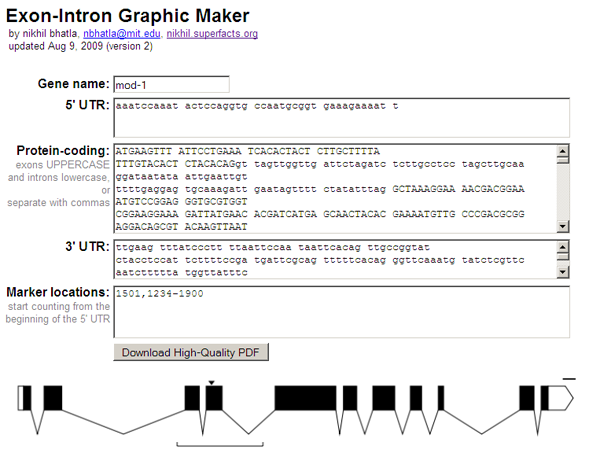
UPDATE #1 (Aug 9, 2009): I've just updated the Exon-Intron Graphic Maker with a few more features. You can now use it to draw untranslated regions (UTRs) of genes, indicated as white, unfilled rectangles. It's also easier to input your gene sequence, as exons can be indicated as UPPERCASE bases and introns as lowercase (which is how some services, such as the C. elegans sequence repository at WormBase.org, store their sequences). You can still enter exons and introns separated by commas as well, if you don't use case in this way in your own sequence files. Finally, you can also enter specific locations or regions, and the program will draw arrows and brackets around the regions. This can be useful for indicating mutations and deletions in your gene.
=======
ORIGINAL POST (Jul 25, 2009):
(OK, so I just made a simple tool for biologists that probably won't appeal to 99% of the people who read my blog. Nonetheless, I blog on. Let's start with some basic biology.)
The most important concept in the field of molecular biology is known as the "central dogma". The central dogma basically says that in a cell, DNA is used make RNA, and RNA is used to make protein. Proteins are the physical chunks of molecules that enable the cell to do many of the things that a cell does: move around, ingest things, secrete things, stuff like that. While the central dogma is a simplistic view of molecular biology, it seems to be mostly right.
So let's talk about the first two pieces, the DNA and the RNA. DNA and RNA consist of repeated molecules chained together. The molecules that make up DNA and RNA are called "nucleotides" (also known as "bases"), and there are 4 different kinds: adeninine (A), cytosine (C), guanine (G), and thymine (T) in DNA or uracil (U) in RNA. When you identify the order of these nucleotides in a specific piece of DNA/RNA (e.g. ATTTTCGATCGCTTTAGC) you're said to have "sequenced" the DNA/RNA.
What surprised many biologists when they began sequencing DNA/RNA was that though there was a ton of DNA (billions of nucleotides in humans, a hundred million in the microscopic worm C. elegans), only a small fraction of it was found as RNA. If I remember right, the statistic is something like ~1% of DNA actually transcribes into RNA in humans.
One last definition: a portion of DNA that will eventually be converted via RNA into a single protein is called a "gene". So within a given gene, biologists found that some parts get cut out of the associated RNA before it can be translated into protein. These parts of a gene are called "introns", while the parts that eventually become protein are called "exons".
Phew, background done, now to the meat of it all. Often when a biologist publishes a paper on a gene they've been studying, they'll show the exon/intron map of the gene in a simple schematic like so:

In this graphic, the exons are indicated as black rectangles. Filled rectangles indicate RNA that is translated into protein, while unfilled rectangles indicate RNA that is not translated into protein, though also not cut out like introns are. The introns are indicated as bridging gaps. This representation of an intron is appropriate because the RNA effectively gets "stitched" together in this way, with introns getting cut out. In the example above, the gene has 8 exons and 7 introns. These diagrams are also supposed to be to scale, so that the lengths of the rectangles and gaps correspond proportionately to the lengths of the exons and introns that underly them. The little downward arrows above the exons point to specific bases (e.g. ones that have been mutated). The upward-facing horizontal brackets below the introns indicate regions of interest (e.g. parts of the gene that have been deleted).
I was talking to some labmates about these graphics, particularly wondering how they generate them for their papers. As it turned out, both of my friends effectively drew them by hand on a computer, counting out the number of nucleotides in each exon and each intron and drawing boxes and lines of rougly the same proportions. This seemed tedious and error-prone, so I asked them if they knew of any programs that could make these graphics for them. They knew of none, and I mentioned that it would be trivial for a programmer to make one. They thought it would be really useful if someone made such a program, but of course they themselves didn't know how to program. So I added it to my mental list of nifty tools for scientists that I might one day make.
Waking up this Saturday morning, I sat in front of my computer with nothing particularly interesting to do. For reasons still unbeknownst to me, 7 hours later, I snapped out of a reverie to discover that I had written such a program (the example above was rendered with it). So here it is:
Perhaps the most important feature of this webapp is that it produces a vectorized, high-quality PDF of the inputted gene model. When submitting a paper to a journal for publication, the journal requires high dpi, publication-quality graphics (simple bitmaps just don't print well). With a PDF containing vector graphics the biologist can scale the gene model to whatever size and resolution they wish, annotate it with other information (e.g. scale, gene name, mutation names), and submit to the journal, all without any loss of visual quality.
Anyhow, that's it. Useless to most, but hopefully somewhat useful to some. I know at the very least that I'll use it, assuming I can find a gene important for consciousness :)
Read comments (12) - Comment
Tron
- Jul 25, 2009, 10:27p
Thank you very much for making this available.
belle
- Aug 5, 2009, 7:16a
this is the best thing since sliced bread!! thank you just saved me thousands of hrs
dude,
- Nov 3, 2009, 6:33p
awesome.
jasonII
- Nov 12, 2009, 8:59a
Thanks, this works great. A few things though. Some of us work on large (18kb) genes. Is there any way to change the scale bar? Also, being able to indicate alternative spice events would be nice.
nikhil
- Nov 18, 2009, 9:29p
Thanks for the request jasonll. I've updated the graphic maker so you can now change the size of the scale bar, to be something more appropriate for your 18kb genes. Not sure what the convention is for indicating alternative splice sites - why not just make 2 separate gene models? I guess if there are several it would be nice to consolidate them into one image. If you have any ideas about what this would look like, lemme know.
nikhil
- Nov 19, 2009, 11:54p
Alan Marnett over at Benchfly.com asked me to write a blog post for them about the Exon-Intron Graphic Maker. It's just like this post, slightly revised. Storing the link here for safekeeping.
http://www.benchfly.com/blog/making-dna-look-simple/
omar
- Nov 29, 2009, 11:07p
dude this has advanced my research significantly
jasonII
- Feb 21, 2010, 8:40a
thanks for the scale bar modification. about the alternative splicing, i suppose it would be helpful if you could color them in. this would also be helpful to mark out certain functional domains easily. three or four colors would be wonderful and spice things up a bit!
siavash
- Apr 4, 2010, 6:10p
hi nikhil,
i also wanted to thank you for making this available. saved me so much time. also wanted to second jasonII's comment about other colors, for marking protein domains, etc.
but its wonderful, thanks a million.
Nick
- Nov 15, 2010, 7:09a
Thank you very much for this. I am an undergraduate doing a genetics research project and this has given me the ability to graphically show exon and intron positions the way I wanted to!
Pascal
- Feb 27, 2012, 7:34a
Great tool. What you also might want to consider is that UTRs can be across more than one exon. I think with the current options it is not possible to do that.
nikhil
- Mar 10, 2012, 7:36a
Pascal, actually I think you can do what you want.
Just like with the protein-coding field, separate exons and introns in the UTR fields with commas, and you'll be all set. That way you can display a single UTR containing multiple exons and introns.
« To Be Conscious in a Body, Frozen
-
Tugging Bubbles in a Box »
|